There’s a bait-and-switch going on at Huntington Beach Art Center. It seems that many of the 20 artists in co-curators Jim Ellsberry and Suzanne Walsh’s “Color Vision” didn’t get the note that the exhibition’s theme is about hues, tints, shades and tones. Most, in fact, seem less interested in playing with color than in walking a blurry line between sculpture and painting.
Beginning with those that do focus on color, some of the most startling are Victoria MacMillan’s striking Downtown, Yield and Marie Thibeault’s Morning Cities. In contrast to the gray palette of standard concrete-jungle cityscapes, MacMillan gives the underbelly of a freeway overpass yellows and pinks, while the street below radiates deep ocean blues, fluorescent greens and stop-sign reds. More abstractly, the reds and greens in Thibeault’s painting are used to redirect our attention, pulling our eyes to the center and bottom of the canvas. That stills the unfocused bedlam of her wide swath of urban destruction, pulling focus to what feels like a cross between The Wizard of Oz and a chalked-out crime scene.
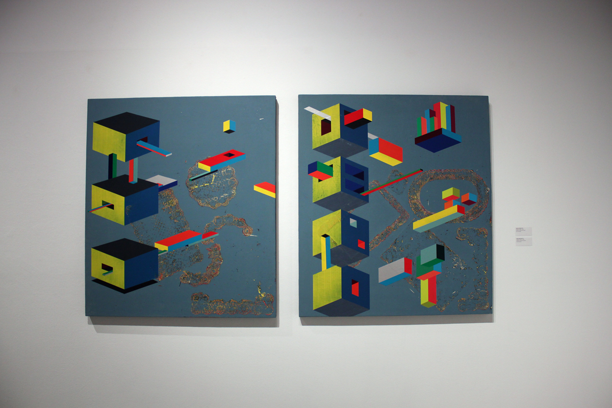
David Michael Lee’s stacked “pleasure cube” canvases—primary-color rectangles shyly poking into squares against a retro teal background—have a similar flavor. Creatively stained by what appears to be a painted doily in several spots, the image doesn’t speak to me on a narrative level, but once you’ve seen it, the geometric erotica is unforgettable. It would make an amazing wallpaper.
I’m a huge admirer of Victor Hugo Zayas’ thick, oversized city and nature studies, in part because they look so much as though they’ve been carved out of paint. His two oil images here—a portrait of a geisha in violent disarray contrasting with the second of a peaceful, reclining nude—are a break from his recent work, focusing on the figurative. But his use, yet again, of muted environmental greens, browns and blacks gives them a feel as if they’re pale copies of older, better work.
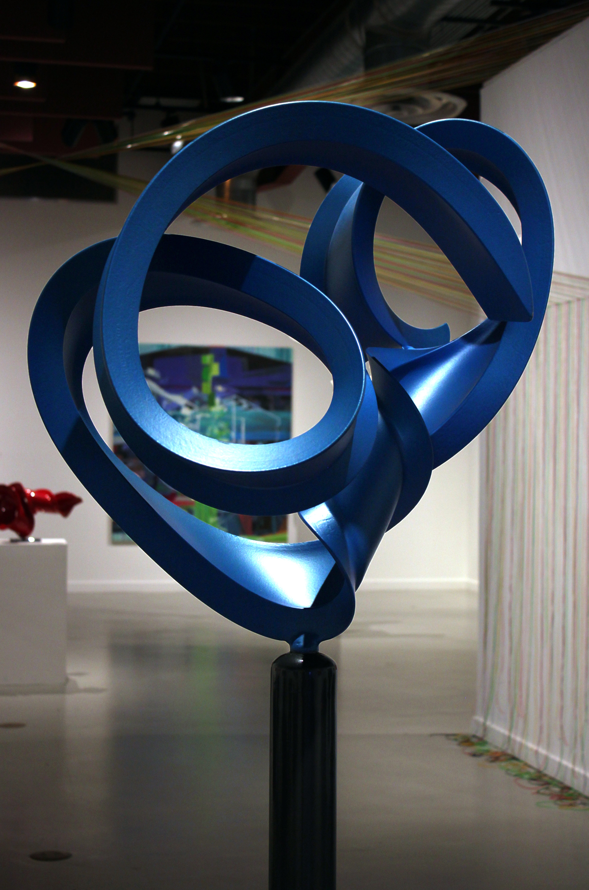
Color figures prominently in the aesthetically perfect painted sculptures of artist Bret Price; his seemingly light-as-air steel squiggles and whirls capture moments of movement as though they were metal Polaroids. The Donald is an orange scribble of No. 45’s profile, complete with Propecia-generated mop of hair. Red Vortex’s sci-fi corkscrew deliriously loses its shape as it begins to coil in on itself, while Blue Swim reminded me of a gaggle of arrow-headed flatworms writhing around one another. Cross Current, also in blue, is a beautiful bit of the ocean caught mid-curl.
No paint is involved in Connie DK Lane’s Elemental Convergence, the artist’s abstract rainbow ode to the harmony of nature. Created from plastic lacing attached at the top of two entryway walls, crisscrossing one another in a canopy, they’re stretched, tied to small screw-eyes and left to fall down the side of each wall. The piece is simple, even comforting, like a child’s living-room fort made of blankets.
I was equally enamored with Caesar Alzate Jr.’s startling red Object No. 008 and Object No. 004 paintings, their layered acrylic creating a surface resembling the luxurious plush of a carpet. Adam Sabolick’s two paintings also brim with texture: Well Is Well has a forbidding background, the color mixed so dark that only tiny hints of brown and green are evident, the artist decorating the void with ropes of paint only slightly brighter, squeezing them straight from the tube onto the canvas in three thick ropes. Another piece, Paradise Bloom, dispenses with hints of color altogether, its dusky layered paint creating the appearance of a picture frame around a white square in the middle. It’s too easy to get bogged down in the mechanics of Tom Dowling’s Double Shuffle, the drabness of his painted surfaces secondary to the smooth lines and numerous complexities of its construction.
There are groupings of squares, one the pale color of an Orange Bang, the second in white with a black line at center, almost obliterated by a beige EKG. Separated by a thin teal strip from the first grouping, the third and fourth squares share compliments of each other’s black and white, a penciled pair of angled lines bisecting the last. All four rest atop a diminutive shelf of unpainted blond wood, partitioned to match the breaks of the first three squares. A small block of fluted paper is nestled inside the shelf, the top painted black. The long, boxy shadows created when light hits the piece adds further dimension wholly unassociated with color.
Shoehorning work into a themed exhibition is the modus operandi of group shows as large as this, so the fact that not everything fits the stated mission generally deserves a big shrug. However, an exhibition that isn’t tightly controlled by its curators isn’t always a bad thing: It may end up casting a bigger net than its title’s narrow definition. On the rare occasion that that happens, as it does here, be grateful.
“Color Vision” at Huntington Beach Art Center, 538 Main St., Huntington Beach, (714) 374-1650; www.huntingtonbeachartcenter.org. Open Tues.-Thurs., noon-8 p.m.; Fri., noon-6 p.m.; Sat., noon-5 p.m. Through June 16. Free.
Dave Barton has written for the OC Weekly for over twenty years, the last eight as their lead art critic. He has interviewed artists from punk rock photographer Edward Colver to monologist Mike Daisey, playwright Joe Penhall to culture jammer Ron English.
I recently tried CBD gummies from this website https://www.cornbreadhemp.com/collections/full-spectrum-cbd-oil as a replacement for the first prematurely and was pleasantly surprised by the results. Initially skeptical, I start that it significantly helped with my anxiety and doze issues without any remarkable side effects. The oil was effortless to speak, with clear dosage instructions. It had a kindly, earthy grain that was not unpleasant. Within a week, I noticed a patent convalescence in my overall well-being, instinct more relaxed and rested. I appreciate the ingenuous technique to wellness CBD offers and aim to continue using it.